Introducing Tanium’s New Data Experience
Announcing Tanium’s most advanced data exploration and visualization capabilities to date
We are excited to announce the recent release of Tanium’s most advanced data exploration and visualization capabilities to date. This post will cover what we built, why we built it, and the methodology behind how we designed this new experience from a UX and Product perspective.
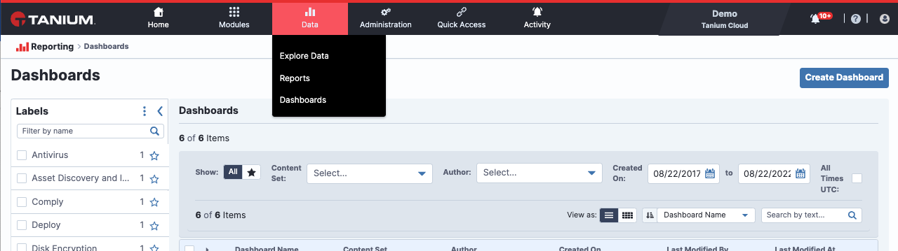
Data Navigation
Tanium Data: Our newest core capacity
We recently released a new core capability in Tanium called Data. This new section allows operators to easily find, combine, filter, format, visualize, share, and act on results without having to leave the Tanium Console.
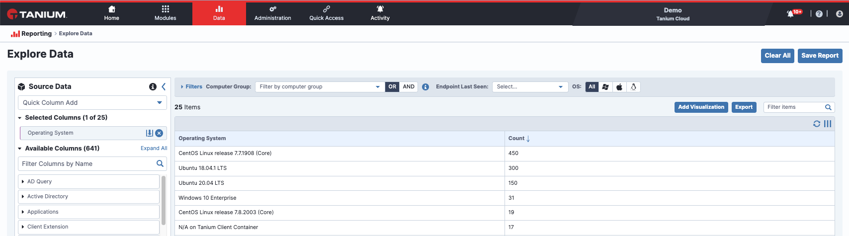
Explore Data
Users can now retrieve attributes from their endpoints quickly and easily with our Explore Data tool. They can search or browse columns (these are data attributes also known as sensors) on the left to add to their table on the right. They can then filter, format, and visualize the data to save it as a report to review later or to share with others.
Explore Data
Reports
Users can save, view, and share data they’ve collected using Data Explorer.
Unlike Interact, which uses our Natural Language Question Parser to collect and store data, Data was built on top of our new data layer called TDS (Tanium Data Service). TDS is a near real-time cached data store that maintains historical query results for both online and offline machines. This enables users to get precise, near real-time visibility on all machines in their environment, regardless of whether an endpoint is online or not.
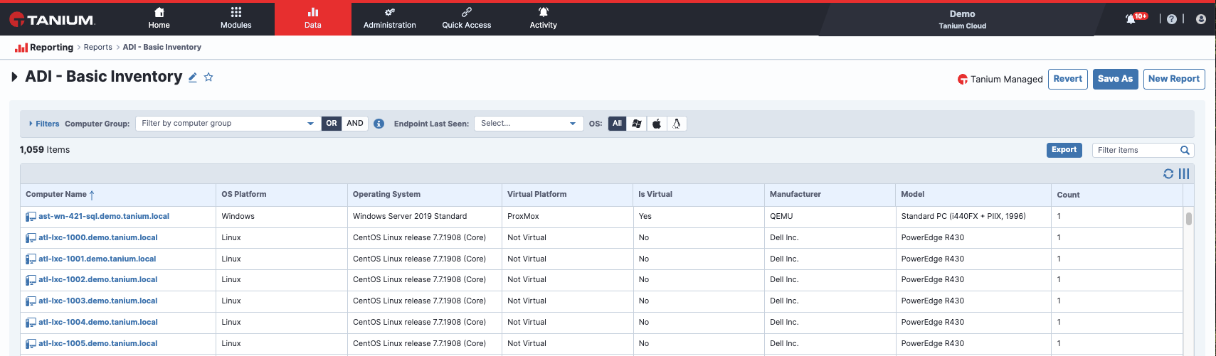
ADI Report
Dashboards
Dashboards allow users to build visualizations with a variety of chart types within reports and then easily layout, customize, clone, and resize those visualizations in nearly any configuration. This enables operators to create data dense dashboards, providing insights into the most critical issues in their environment.
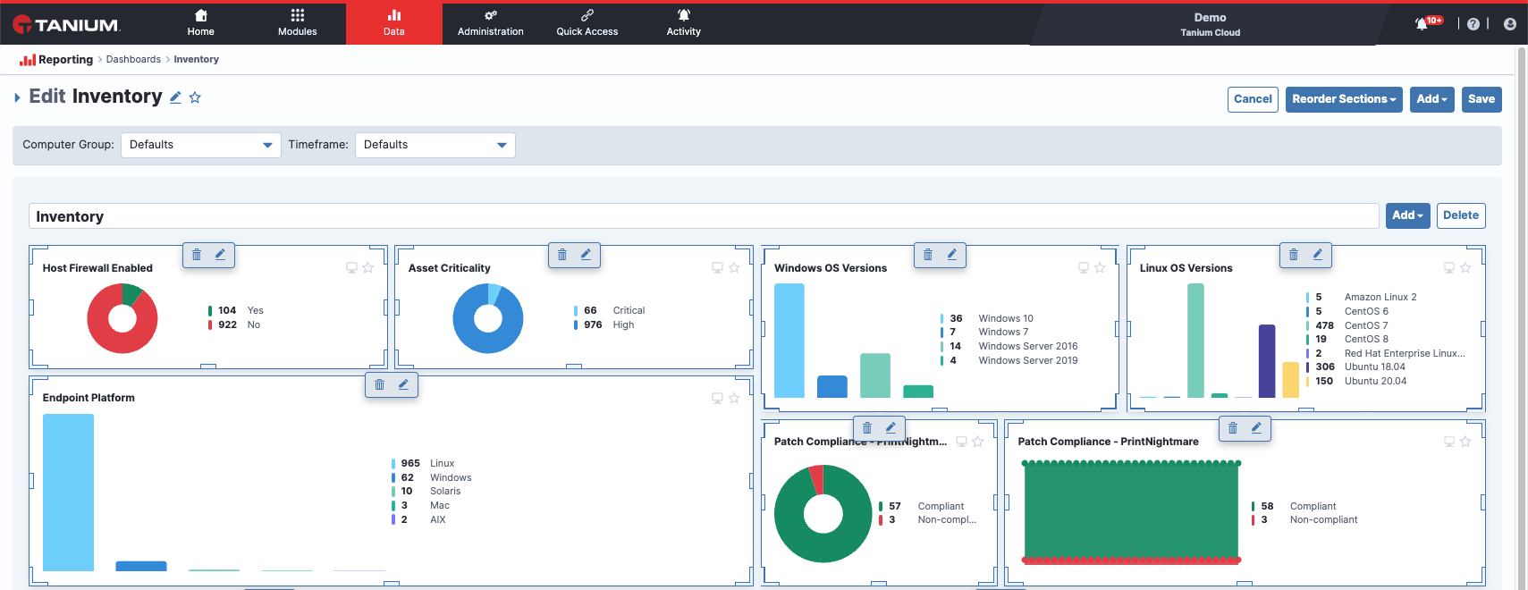
Edit Dashboard
These dashboards are also now available on the homepage and users can choose which dashboards are most relevant to them and arrange them on the page to optimize their workflow.
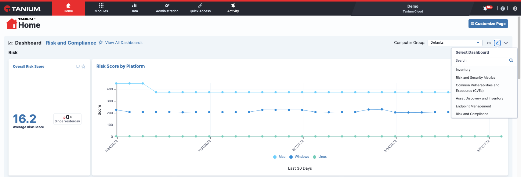
Tanium Console Homepage
Our customer-centered approach
This entire project was the result of customer feedback from our PMs, TAMs, SMEs, and Sales teams. Product Management worked with the UX Team to define and prioritize the most critical pain points, and we transformed those into user requirements and design solutions. Using an iterative design process, we pivoted several times based on user feedback gained from informal and formal user research studies.
Lessons learned from existing designs
We first researched what was most important to improve in our existing Trends and Interact experiences. That research resulted in a host of small improvements for those modules as well as opportunities for the new Data experience we were embarking on.
Improvement opportunities for Trends:
- Offer additional flexibility for layout and configuration
- Improve responsiveness of chart panels
- Add additional chart types
- Simplify the drill down actions into the underlying data
Improvement opportunities for Interact:
- View data from both online and offline endpoints
- Provide a visual option to query data in addition to the natural language processor
- Add capabilities to filter, group, visualize and share data
- Improve response times of querying data
- Unify data spread across multiple modules and locations
Lessons learned from new designs
Homepage redesign findings
Users appreciated the ability to get an informative overview of the environment and found much value in the efficiencies gained by featuring dashboards on the homepage. However, they were confused by the new presentation of the “Build a Question” feature, so we iterated further to ensure its purpose was clear.
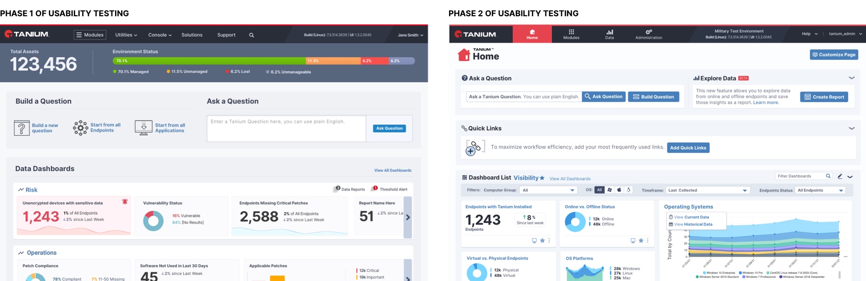
Homepage testing
Explore data findings
The first round of testing resulted in rich findings and warranted another round of design iteration and prototyping. As you can see from these early designs, we have pivoted quite a bit based on user feedback. There were many changes made, including:
- Consolidating and simplifying filters
- Changing labels to be clearer
- Exposing which sensors/columns had been selected
- Allowing users to add visualizations
- Providing a “Quick Column Add” for users who know what they were looking for in addition to the ability to browse by category
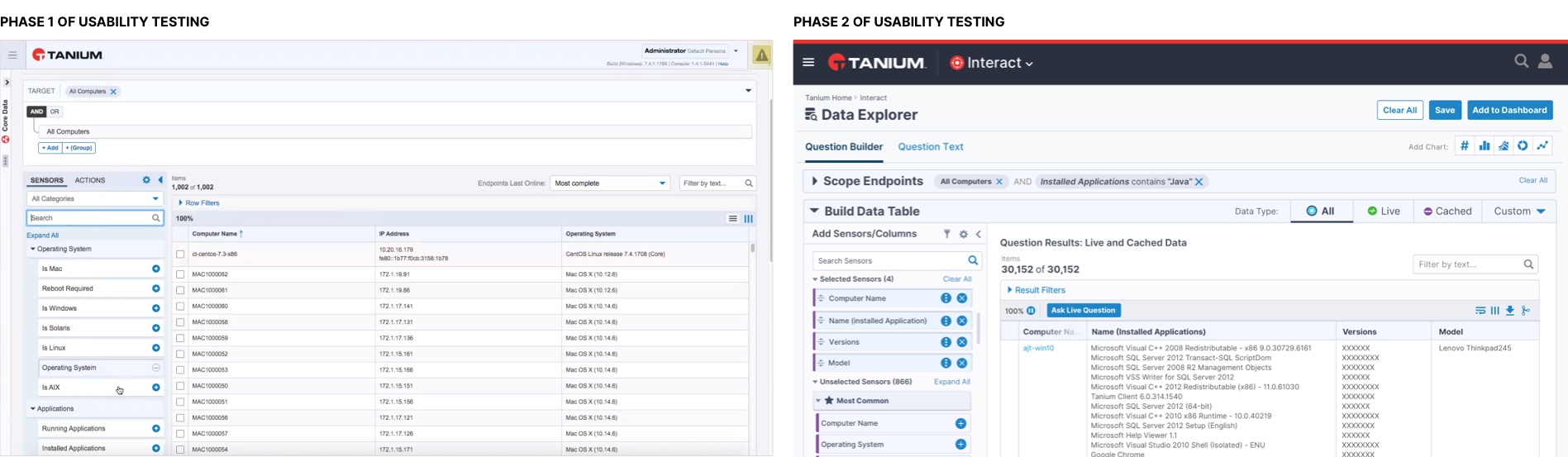
Data Explorer Phases
Software design and development is an ongoing process, so as we continue to iterate on these experiences, we look forward to hearing your feedback. You can email our User Experience team at [email protected].

Tanium Subscription Center
Get Tanium digests straight to your inbox, including the latest thought leadership, industry news and best practices for IT security and operations.
SUBSCRIBE NOW